Have you ever had information that you wanted a group to really dig into? Something important, like a survey or retrospective on important issues across multiple teams in your organization?
You’re so excited to finally have insights into issues that have plagued you. With great expectations, you present your results and then:
Crickets…
Sometimes, the problem isn’t your data, it’s the packaging.
We’ve evolved to notice new things or changes in our environment. This is how our ancestors saw the lion, tiger, or bear before it got them.
Today, this is how we notice the car that’s suddenly veering into our lane or quickly stopping in front of us.
Problem is, most data is presented in the same old boring graphs or tables; nothing new there!
Novel visuals attract our attention, just like lions, tigers, or bears. Our brains are hard wired to notice things that are new or changed.
We’re also visual. When data can be processed visually, we’re more likely to dig into the details and relationships, or at least get the gist of it all more quickly.
A visual presentation that’s new to your audience is the perfect “bright and shiny object” to capture attention and draw people into your content.
I’ve used this idea to shift the focus of conversation across large organizations.
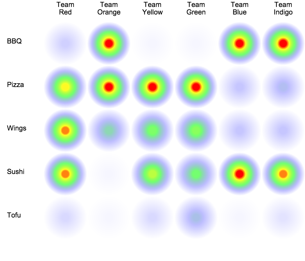
For example, introducing a new way to visualize project status can get people looking at things more deeply or from a new perspective.
Using this new visual for regular project reporting, can move conversations in a more productive direction, permanently.
A word of caution, a useful visual is very different from chart junk. What you need is a visual that makes the information easier to process.
Your visual has to help people understand the data and ideally, be unique enough to attract attention.
But shouldn’t a good idea just stand on it’s own? Well yes, but every idea gets packaged. Good ideas in bland, ugly, or hard to consume packages are often ignored.
Some might worry about “tricking” others into digging into their data, but in today’s world, you have a lot to overcome. Smart phones, tablets, and laptops are everywhere. Sometimes your participants need a jolt to see anything. So don’t be shy about using every trick at your disposal.
So pull your audience into your content, spice up your data, and kill the crickets with an unusual visual presentation.